Family portraits

From idea to framing

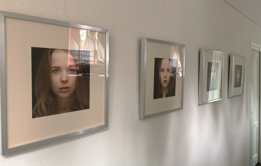
In our hallway we have some family portraits of our kids. But the portraits were taken some years ago. Time for some new ones! But we would also like to hang the portraits of their partners. The previous portraits were color portraits. This time I would like to do some black and whites. So the challenge is take seven portraits, each with the same look and feel. This is how I did it.

Old family portraits in hallway

Portraits with same look

First of all the seven new portraits should have the same look. I chose square format, f-stop 2.8 and a small light at the left side of the neck. So sharp eyes with fading sharpness to the back of the heads.  I have a lens that goes to f-stop 1.2 (85mm canon), so the sharpness at 2.8 should be great.

Studio setup

My studio was made mostly black. The main light from right above and stopped all the way down. One main fill in light from under to fill up the shadows. One light at the background to make a beautiful gradient. The fourth light with a grid should make a small light at the left of the head.

Studio setup
Studio setup

After setting up the lights with the right settings it was time to get the kids in the studio. I asked the kids to set their face to neutral. Well that was easier said than done. Because the lights already were set up, I could only focus on framing and wait for that neutral look. 

Don't smile just look neutral
“Don’t smile just look neutral”

Post processing

After the RAW images were shot it was time to do the post processing. After removing the pimples and blemishes on the skin in Photoshop, the pictures were send to the Nik plug in Silver Efex Pro. I made two presets, one for the girls and one for the boys. The presets were made to preserve that all the images had the same look. The girls preset was a little softer while the boys preset was a little harder with more detail. All the black and whites had just a tiny bit of sepia toning (only 10%) to give it just that little bit of warm feel.

From RAW to Lightroom to Photoshop to Color Efex Pro

Printing

After this post processing it is time to print. I chose for these portraits a paper of Canson, Canson Baryta Prestige 340gsm. The processed version of the image was send to Photoshop and resized to 40x40cm. After that the images where sharpened in Nik Sharpener Pro 3 Output Sharpening. I downloaded the right ICC profile for the paper on the Canson website. A magic moment occurs for me when the print is coming out of the printer. The printing proces with that smell of ink is for me that magical moment.

Portrait printed on Canson Baryta Prestige 340gsm

Framing

Finally it’s the time to choose the right frame. In Groningen their is a frame shop called Richards Kunst In Lijsten. The same name with myself is just coincidence ;-). 

Richard van de Berg at work 

Framing is an art. It makes the picture complete. Besides that a good framed picture has to look like art in my opinion. I choose the frame as seen in the picture above. With no glass in front of the picture. The frame is almost anthracite with a small silver facet on the inside of the frame.

Decision made

So my little project came to an end. The portraits are hanging in our hallway. What I learned? Focussing on the eye with F-stop 2.8 can be really tricky. For post processing I made presets which gives the portraits a unified look. Framing is expensive but worthwhile. 

Portaits hanging in the hallway

Also published on Petapixel a leading blog covering the wonderful world of photography.

Tagged , , , , . Bookmark the permalink.

Comments are closed.